Extended Entry Deadline: July 24th! | Enter Now
Beyond the Build
/nk.studio's Site Redesign
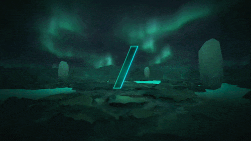
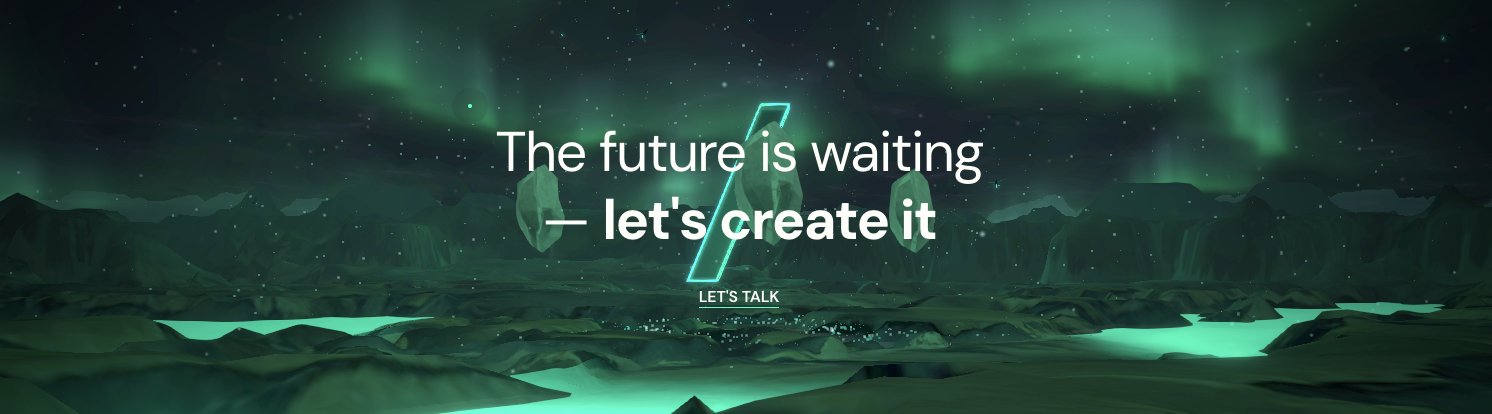
/nk.studio rebuilt their digital home as a living universe anchored by one visual concept: the slash in their name. It acts as a portal, guiding visitors through micro-universes packed with neon-green light, hidden easter eggs, and musical and physical interactions that make the site feel less like browsing and more like discovery. The project earned /nk.studio multiple w3 Awards, including the 2025 Gold Award in Website Features: Best User Interface. Explore their site to see what happens when a studio builds a world instead of a website.

What sparked the site redesign?
The project was inspired by the need to reflect how our studio had evolved over the past four to five years. Our services, team, and creative culture had grown significantly, and the previous site no longer represented who we are today. We wanted to create something inspiring, enjoyable, and aligned with our current vision. Rather than simply redesigning, we aimed to build a platform that captured our evolution — a space that communicates our expanded capabilities, new verticals, and the pace at which we operate. The launch also coincided with our transition from estudionk.com to nk.studio, reinforcing a new chapter for the brand.
What inspired the creative direction?
The creative direction was driven by the idea of expanding the NK universe — blending imagination, creativity, and a slightly dreamlike atmosphere. We used the slash as a conceptual portal, a visual device that guides users through different worlds, shifting scenarios and perspectives as they navigate the site. This allowed us to create a fluid experience where design, motion, and storytelling coexist. The goal was to express creativity as a journey, constantly moving inward and outward, revealing new layers of the studio’s identity. It reflects how we think: exploratory, playful, and always evolving.
How did the concept for the site evolve over time?
The concept evolved from our previous website, where the slash was already present as a visual element. Over time, it gained volumetry and became a spatial device capable of creating depth and navigation. This evolution led to the creation of micro-universes for each section of the site, allowing every area to have its own identity while remaining connected to the overarching NK narrative. The slash transformed from a graphic symbol into a structural concept, not only shaping the digital experience but also supporting broader brand communications. It became a flexible system that extends beyond the website into the studio’s visual language.
Tell us about the team!
This project involved the entire NK team, with contributions from 3D artists, designers, developers, content creators, and QA specialists. Because it’s our own platform, there’s always an extra level of care and commitment. During the process, a personal milestone also shaped the project: I was about to become a father, and the team created a digital tribute by designing auroras for the homepage — inspired by my daughter’s name, Aurora, and my passion for space. That gesture captures the spirit of the team: talented, collaborative, and deeply invested in what we build together.
Tell us about a pivotal moment or challenge putting it all together.
One key challenge was managing expectations around launch timing. We initially introduced a public countdown, but as development progressed, we realized that meeting that deadline could compromise quality. We ultimately postponed the launch three times. In another context, that might have been seen as a mistake, but for us it was the right decision. Our audience includes designers, developers, and technology leaders — people who value execution. Choosing to prioritize quality over pressure allowed us to refine the experience and deliver a stronger final product.
What’s something that surprised you most when working on the site?
One of the biggest surprises was how quickly the team brought new ideas to life. At one point we asked ourselves: why not make the experience accessible in immersive environments? Within two days, the site was already accessible through Meta Quest. That level of speed and experimentation showed how aligned the team was and how flexible the technical foundation had become. It reinforced the idea that the project wasn’t just a website, but an evolving digital space open to new forms of interaction.
At what point during the site redesign did you feel it was built to win?
Honestly, from before we even started. Whenever we build a website for a client, we approach it with the mindset that it should compete and stand out at the highest level. In this case, we knew we had greater creative freedom and the ability to take risks. That combination made us feel from day one that the project had the potential to win. Of course, awards are never guaranteed — they depend on timing, industry trends, and what others release. But the ambition, the concept, and the level of craft we planned gave us confidence that it was built to win.
What is your team building next?
We’re currently working on several exciting projects. One of them explores a timeline-based experience with a strong narrative component, while another is a large-scale e-commerce platform for a long-term client — one of the biggest we’ve worked on. These upcoming releases continue our focus on blending design, technology, and storytelling, and we’re excited to share them soon as the next step in our ongoing evolution.
Are you crafting work that’s lightyears ahead? The w3 Awards honors the best digital creativity like /nk.studio’s. Enter your projects by the Extended Deadline on Friday, July 24th. This is your last chance to prove your work is built to stand out.